
With the first quarter of 2018 all but behind us, it’s time to look at what significant events we have seen and the implications they may have for the rest of the year. For clients who remember, last year many of our models suggested that the likelihood of increased volatility in 2018 was highly probable.
Looking at global equity markets today, this is a no brainer. However, just because volatility has risen in one asset class, it may not necessarily mean other asset classes experience the same (or similar) increases in volatility.
Today we will explore the concept of volatility further; what it may mean for your models; and what it may mean for the weeks and months ahead.
What is Volatility Really all About?
In statistics, volatility is a measure how far, wide or large an asset’s value changes from period to period, or what is known as dispersion. All traders are undoubtedly aware of the term, especially when the market gets very wild (generally high volatility) or when things are very quiet (generally low volatility).
Volatility is a core component of all markets; and for traders it is often essential for the livelihood of their models, strategies and even trading styles. This is because in a fictitious world without volatility prices would hardly move; and as such certain levels of volatility are required for price fluctuations.
You may now be asking- how do I know what ‘volatility’ is?
To answer this question in more detail- we will explore different types of volatility; and more specifically the different ways to measure them.
Measuring Volatility – There Are Many Different Kinds
Before we explore different ways of measuring volatility, we should first understand that there are different types of volatility measures and environments for which they may/may not perform in.
For example- in 2017 we witness very low levels of volatility in the S&P500. A simple approach to understanding the volatility in the S&P500 can be gleamed by looking at the VIX contract.
The VIX, an index which began in 1993 looks at the 30-day volatility of S&P500 option prices. Historically, VIX levels above 30 have indicated high volatility, whilst levels below 20 indicate low volatility.
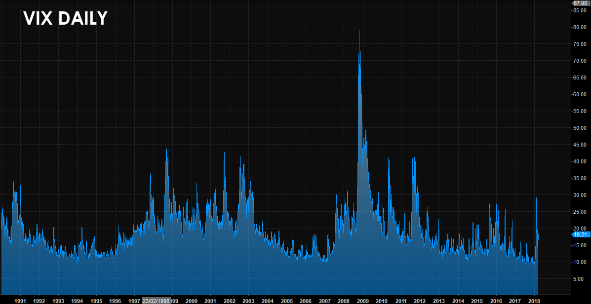
 Chart 1.0: Historical VIX prices
Note the longer periods of high volatility on the chart above showing:
- The tech bubble which started in 2000 and
- The GFC (2008)
and of-course shorter periods of high volatility including September 2001, the May 2010 flash crash, the Sovereign debt crisis of 2011 and more the China fears of 2015 and the recent VIX blowout last month.
Obviously during periods of high volatility, we tend to see large price fluctuations and quite often significant news events. Here on the desk we pay very close attention to certain models which may be affected by this volatility; as market dynamics can change very quickly during such times.
The chart of the VIX above also shows us prolonged periods of low volatility in the S&P500.
During these times we tend to see prices of the underlying asset as more ‘stable’. This may be an ideal environment for traders and models that are more passive, and do not trade as frequently or even as short-term.
As we can see, using the VIX is a simple way of measuring S&P500 volatility. But what do we do when we are looking at another market or asset class such as foreign exchange?
Other Ways to Look at Volatility
There are many different methods of identifying volatility and just as importantly- the lack of volatility.
An example of this was in the lead-up to last month’s VIX blowout, we identified that the S&P500 had experienced the second longest run of weeks without a 2% change (only eclipsed during the mid 1960’s).
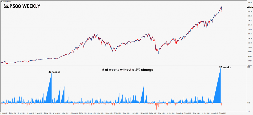
 Chart 1.1: Number of weeks without a 2% change

Amongst other things- this also alerted us that the chances of a significant move (correct or spike higher) were increasing as every week went on.
But can this method work in other markets?
Let’s take a look at the EURO, a market where volatility has been suppressed; in part due to:
- Stabilising Central Bank Policies and
- Historically lower geopolitical tensions amongst Euro countries.
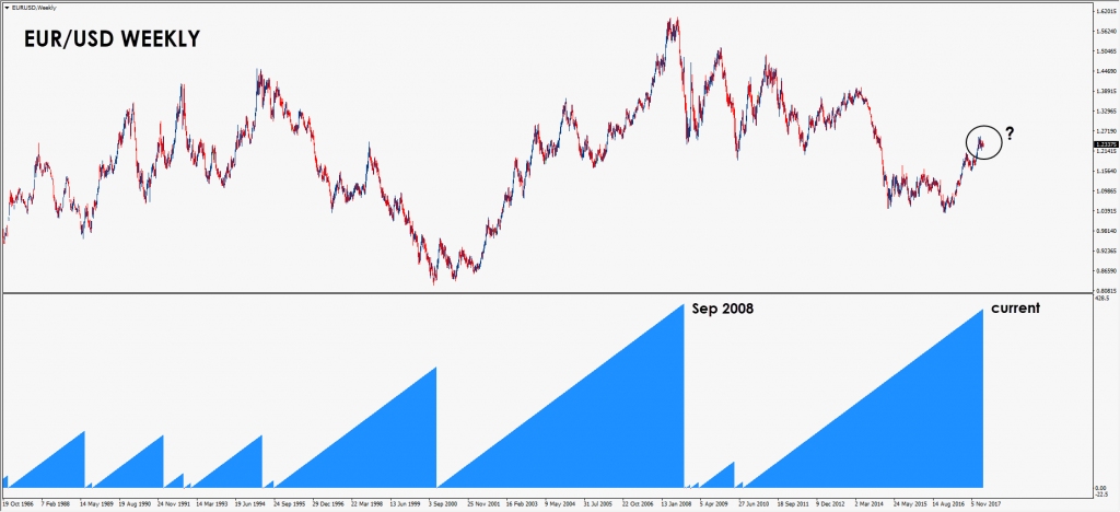 Chart 1.2: Number of weeks without a 4% change

So the question we ask you is- will volatility remain low in the EURO this year?
In the examples above we showed a rolling sum of these changes, however another approach can involve looking at the changes in price and perform this across many different periods.
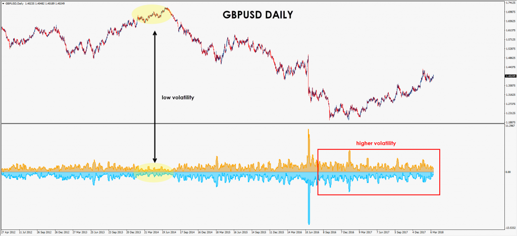
Chart 1.3: Historical volatility on the Pound, 2012 – Present

On the Daily chart of the GBP/USD above, we can see that since Brexit, volatility has significantly increased compared to that of the previous 5 years.
Is this a sign of things to come as we approach Brexit’s D-DAY…?
What is Better? High Volatility vs Low Volatility
As we should now see- volatility is often looked at as a function of time.
This is why high volatility environments can offer greater opportunity in the short-term as traders look to benefit from larger gyrations and swings.
The next chart below shows two charts containing the most volatile day on the Dow in 2017 vs the most volatile day we have seen this year:
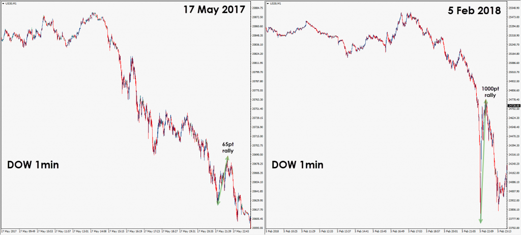

Chart 1.4: 1 minute charts of the most volatile DOW days of 2017 and 2018 (at present)
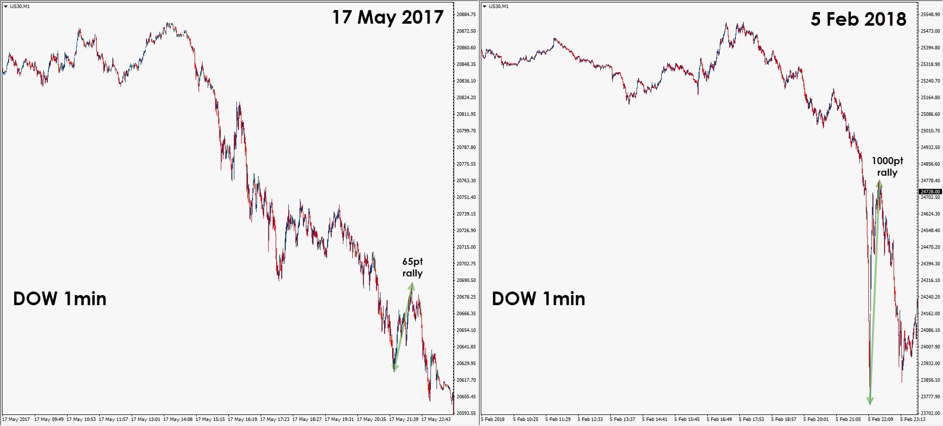
We can see that whilst the charts show similar patterns leading into the US session, the volatility was very different; and much higher last month’s sell-off. This is important to realise as changes in volatility can very quickly affect your models.
For example: If you were short prior to the large decline on 5th Feb 2018, any short positions that were not closed out prior to the bounce would have had to withstand a 1000-point rally! Now THAT is high volatility!
It’s worth noting that even in percentage terms (relative to how far down the day was), that intraday rally was far greater than the biggest rally shown in last year’s chart on the left (hint- this is another way to measure volatility!).
Summary
It’s no coincidence that looking back through time we see many instances (and correlations) between low volatility and rising social/geopolitical tensions. At which point when (if) society goes bananas, volatility roofs it.
At the moment-
- Politics have become less stable as we have seen in the US, UK, Europe, Japan and even in developing areas of the world i.e. Latin America (Mexico, Venezuela).
- Central Banks and their policies are eerily quiet
- Times and business are great!
Many of these events are precursors to greater volatility and often result in a number of geopolitical hotspots around the world.
With this in mind we are always cautions of the low volatility trap, and ready for an increasing volatility that could come at any time.
For many years we have been in an environment where excessive monetary stimulus has kept asset prices inflated (and rising), with low volatility across major markets. Central bank stimulus has lowered risk premiums and volatility in rates and credit markets. This has brought investors back into the market seeking riskier assets (i.e. stocks and you name it- cryptocurrencies) in order to generate returns.
Now that volatility has risen in stock markets, will these same participants continue to seek riskier assets and higher returns in this asset class? Or will they go elsewhere?
But the most important question of all is this:
